Mobile - Tel UAE: +971 (0) 50 4945873, Office UAE: +971 (0) 4 550 7800 - Ask for Stela
or Email: jeremyfearnsides@gmail.com . Address: Business Gate Center, 10th Fl Ibn Battuta Gate Bldg, PO: 334035, Dubai, UAE
Time Line
Time Line was developed after watching people trying to line up text and shapes from the Excel menu by copy and paste methods. The inevitable result was:
1. It took too long;
2. It was difficult to line up the text and the shapes;
3. It was difficult and tedious to do as graphics for cause and effect are generally required to demonstrate, simply, relevant events (causation) that are the cause of delay to the pertinent activities the events are associated with.
4. It was a very expensive way of producing a simple graphic if outside consultants were creating the grahics.
To address the four negative points Fearnsides and Associates took it upon themselves to design a software application that could be used in:
1. Excel;
2. Had to be easily transportable to a Power Point presentation (as well as being able to be produced in Power Point and not Excel if necessary);
3. Was quick and easy to use by anyone (It had to take seconds to produce. Not hours, days, weeks);
4. Could not be larger in its maximum width form than an A3 sheet, and
5. That graphics and text could be imported on to the time line via copy/paste or computerized automation.
The result was "Time Lime".
Below is a simple Time Line video
This application was originally derived from a requirement that the output could not be more than the width of an A3 sheet. The timeline at the top, with different date inputs, will change according to the overall duration (i.e. the latest date - the earliest date). As such, the different time lines can be had for weeks, months, years etc... which will fill the width of an A3 sheet without having to adjust the time line column widths, and likewise the Gnatt Chart bars extend or shorten as necessary. Of course, one can still do that, however, all one has to do is input the dates in the start date column and finish date column and press the button.
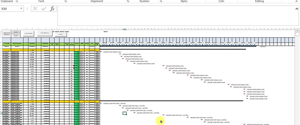
Time Line - A little More Complex

Time line can handle any amount of data and if the baseline column start and finish dates are added it will show the baseline bar also. If a milestone is needed, just enter one start date (update or baseline) and a star will represent the milestone.
If a "Hammock or WBS" activity is required, just leave the start and finish dates empty where you require the "Hammock or WBS" activity and the Gnatt Chart will show the "Hammock or WBS" summary bar in black.
If you want a reproduction of a part of P6, just set up the relevant columns and do a "screen grab" from P6 from the P6 column data. Copy and paste in to the relevant columns in Time Line and the Gnatt Chart time line of the part of P6 data you have grabbed will be re-created.
Time Line - More Complex Still But This Time With The Relevant Causative Events Driving The As-built Critical Path
The data to produce a Time Lime can be extracted from a detailed "Float Map" (Dynamic Analysis) compared to a "Static" (As built v As-planned based on as-built % complete attrition). Both methods provide a different as-built critical path. However, either method can be filtered out and the relevant causative events placed above the effected activities upon the as-built CP derived from either method.

Time Line - Dynamic v Static As-built Critical Paths
This Time Lime solely looks at the Dynamic v Static As-built Critical Paths and shows how the data from other analytical software applications (by Fearnsides and Associates) can be added into Excel to the right of the graphic and the two different as-built critical path methods can then be compared.
